 Rob Bentley
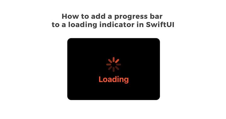
I have a standard SwiftUI loading view that looks awesome.

Here is the code for this view:
struct LoadingView: View

    var title: String

    var body: some View {

        ZStack {

            VStack(alignment: .center) {

                ProgressView()

                    .progressViewStyle(CircularProgressViewStyle(tint:Color(red: 1.0, green: 87.0/255.0, blue: 51.0/255.0)))

                    .scaleEffect(x: 1.5, y: 1.5)

                    .padding(.top, 20)

                Text(title)

                    .foregroundColor(Color(red: 1.0, green: 87.0/255.0, blue: 51.0/255.0))

                    .font(.system(size: 16, weight: .bold))

                    .padding(.horizontal, 20)

                    .padding(.bottom, 9)

                    .padding(.top, 10)

                    .multilineTextAlignment(.center)

            }

        }

        .frame(minWidth: 187.5, idealWidth: 187.5, maxWidth: 187.5, minHeight: 125, idealHeight: 125, maxHeight: 125)

       .background(Color.black)

        .cornerRadius(8)

        .clipped()

    }

}
Eventually, I ran into a situation where I had to set up a customer subscription by integrating with Stripe that relied on 5 nested network calls, and the process took quite a while.
Even with the loading indicator, the UX still needed something. The amount of time the whole process took is longer than a couple seconds, and I wanted the user to know everything was working as it should.
Personally, I just don’t like the standard SwiftUI progress bar, so I made my own homemade one (modified off a Stack Overflow post, of course). Here is the code:
import SwiftU


struct ProgressBar: View {

    @Binding var value: Double

    var body: some View {

        GeometryReader { geometry in

            ZStack(alignment: .leading) {

                Rectangle().frame(width: geometry.size.width , height: geometry.size.height)

                    .opacity(0.3)

                    .foregroundColor(Color(UIColor(white: 0.0, alpha:0.5)))

                 Rectangle().frame(width: min(CGFloat(self.value)*geometry.size.width, geometry.size.width), height: geometry.size.height)

                    .foregroundColor(Color(red: 1.0, green: 87.0/255.0, blue: 51.0/255.0))

                    .animation(.linear)

            }.cornerRadius(geometry.size.height * 0.5)

        }

    }

}
I added this in to the loading view, so it now looks like this:
struct LoadingView: View

    var title: String

    @Binding var total: Double

    var body: some View {

        ZStack {

            VStack(alignment: .center) {

                ProgressView()

                    .progressViewStyle(CircularProgressViewStyle(tint:Color(red: 1.0, green: 87.0/255.0, blue: 51.0/255.0)))

                    .scaleEffect(x: 1.5, y: 1.5)

                    .padding(.top, 20)

                Text(title)

                    .foregroundColor(Color(red: 1.0, green: 87.0/255.0, blue: 51.0/255.0))

                    .font(.system(size: 16, weight: .bold))

                    .padding(.horizontal, 20)

                    .padding(.bottom, 9)

                    .padding(.top, 10)

                    .multilineTextAlignment(.center)

                if total > 0 {

                     ProgressBar(value: $total)

                        .padding(.horizontal, 16)

                        .padding(.bottom, 4)

                        .frame(height: 6)

                }

            }

        }

        .frame(minWidth: 187.5, idealWidth: 187.5, maxWidth: 187.5, minHeight: 125, idealHeight: 125, maxHeight: 125)

        .background(Color.black)

        .cornerRadius(8)

        .clipped()

    }

}
Note: The value for percentage for the progress bar has to be passed in from your main view. My real world use for this is a chain of network calls, but for this example, I added a timer to show the progress bar moving along. It is activated from pressing a button on the screen.
struct ContentView: View

    @State var doSomethingThatNeedsALoadingInidactor = false

    @State var percentLoaded = 0.0

    @State var timer: Timer.TimerPublisher = Timer.publish(every: 1, on: .main, in: .common)

    @State var connectedTimer: Cancellable? = nil

    @State var connectedSaveSearchTimer: Cancellable? = nil

    @State var timerIsOn = false

    var body: some View {

        ZStack {

            Color.white

            Text("Start Loading")

                .foregroundColor(.blue)

                .multilineTextAlignment(.center)

                .onTapGesture {

                    self.doSomethingThatNeedsALoadingInidactor = true

                    self.startTimer()

                }

            if doSomethingThatNeedsALoadingInidactor {

                LoadingView(title: "Loading", total: $percentLoaded)

            }

        }

        .ignoresSafeArea()

        .onReceive(timer) { output in

            self.percentLoaded = self.percentLoaded + 0.2

            if self.percentLoaded == 1.0 {

                self.doSomethingThatNeedsALoadingInidactor = false

                self.percentLoaded = 0.0

                self.connectedTimer?.cancel()

                self.timerIsOn = false

            }

        }

    }

    func startTimer() {

        self.timer = Timer.publish(every: 1, on: .main, in: .common)

        self.connectedTimer = self.timer.connect()

        self.timerIsOn = true

    }

}
Here’s a video of it in action!